

Redesigning Trip Extras for XYZM travelers
American Airlines • April 2024 - Current
When it comes to traveling by plane, purchasing tickets is only part of the experience. X% of customers purchase extras, like seats, miles, and prepaid bags, for their travel.
Challenge
We aimed to unify and improve the shopping experience by integrating ancillary products— like Mileage Multiplier, priority boarding, and baggage —into a single, seamless checkout process. Previously, these products were inconsistently offered, leading to multiple checkouts and fragmented management across development teams.
Impact
We designed a unified experience for MVP to ideal future state. The integrated products are expected to improve the user experience while increasing efficiency for the development teams.
The team
2 designers, 2 product owners, 1 product manager, 1 architect
Timeline
Ongoing since April 2024
My role
Research, applied design, and user testing & analysis
A fragmented and dated experience
Ancillary products had complex integrations with customer channels, product specific processes, and disparate payment experiences. Dependencies between product teams to facilitate maintenance and enhancements with limited visibility into the fulfillment status in the backend.
How might we improve the customer shopping experience for trip extras?
B R E A K D O W N O F T H E P R O B L E M
Separate checkout experiences
Customers managing existing reservations faced limitations with our legacy systems, only allowing the purchase of one trip add-on at a time.
Journey and channel specific
Seats, bags, priority boarding, and Mileage multipliers were inconsistently offered across different channels and customer journeys, leading to confusion and inefficiencies.
Lack of flexibility
The host journey could only handle one product at a time and lacked the ability to switch between products or retain previous selections.
P R O C E S S
Surfacing assumptions
We held an assumption mapping exercise with product stakeholders to understand their perspectives and that of the business. We identified themes from the exercise and developed a comprehensive testing plan for the duration of the effort.

-
Evaluate how to improve user conversion and understanding of booking benefits, enhancement options, and ancillaries on the View Res page.
-
Measure sentiment and understand customer behaviors with regard to Trip Extras. What do they expect? What is valuable to them?
-
Compare design directions to identify which best supports ancillary selection and determine what approach is ideal for multiple ancillary products.
-
Evaluate how images, meal purchases, supplementary offers, customer comprehension, and dynamic messaging affect sales and conversion rates.
D I S C O V E R Y
What customers had to say
Multiple surveys were conducted with hundreds of travelers before we began working on designs we sought to understand customer attitudes and behaviors towards trip add-ons.
Early testing opportunities
From our assumption mapping exercise we determined we could run A/B testing in production with the existing Trip Options page. We hoped to:
Measure the impact of using images may have in describing the benefits of ancillaries
Assess whether photos distract from selling ancillaries or if icons or illustrations would be a better alternative
P R O C E S S
Visualizing key flows
There are 3 journeys we needed to consider: the booking path, check-in, and view/manage reservations. We mapped the existing ancillary journey and worked with our product owners and architects to develop the new flows.
For the MVP, we would focus on the manage reservation flow. In it, we would have individual pages for each ancillary product. Eventually, we would test into the ideal state, a Single Page Application (SPA) featuring multiple trip add-ons. This SPA would enable integration into any customer journey.
P R O C E S S
Iterative exploration
We experimented with different card layouts, including flight trip information, images, & illustrations and methods to shop the ancillaries.


Assessing the MVP
After a few weeks of ideation and data gathering, we conducted a round of unmoderated testing on desktop and mobile concepts. We engaged a total of 14 participants, 7 tested desktop and 7 mobile.
MVP entailed the Mileage multiplier product as a standalone product page in the manage reservation flow.
K E Y T A K E A W A Y S
Too many removal options
Some participants were confused about how to remove the product selection because there multiple options to do so.
Confusion on pricing
"Starting from" pricing created some confusion for testers who were uncertain about the price they would ultimately pay.

Great visual design
Overall, users liked the UI of the experience and could purchase Mileage multiplier easily.

Evaluating competing concepts
Stakeholder feedback on the MVP design and test results led us to continue exploration. We developed two design directions.
The first is an expand and collapse experience when selected expands to show each passenger associated with the reservation and purchase options for the product.
The second option would act like a modal, meaning that upon selection a side drawer would appear and enable the user to make selections for that specific product.

Concept A: Side sheet
We set out to test the assumptions on both designs with 8 customers at an Admirals Club within DFW airport. To make things interesting, we tested both designs on an iPhone 8 and used a complex tasks to evaluate the usability of each concept. We included multiple passengers, a multi-segment flight, a multiple ancillary purchase, and purchasing bags with AAdvantage® status benefits.
Concept B: Accordion


P R E F E R E N C E
Design A
“This is the confirmation I was looking for.”
“I prefer the two separate screens that separates the two views so I can have separation in my mind.”
Design B
“Both are acceptable. Would prefer the accordion on desktop and the side sheet for the mobile experience.”
“No one likes to think.”
Design A
“Very smooth, intuitive, and kept you updated as things were added. Clear and transparent.”
“Easy and clearer to navigate than other airlines.”
Design B
“I like that things were all together.”
“Overall is really simple, no frills.”
P O S I T I V E
C O N S T R U C T I V E
General
“[Bag legend] could have been a little clearer.”
“There’s a lot of info on the screen.”
Design B
“Confused on adding bags per slice... I’m used to the seats experience.”
“Only thing I found a little confusing was checking a bag a for return flight. I don’t think I’ve ever had to do that.”
Advocating for an inclusive experience
After lounge testing, we began to refine the designs and assess the accessibility and discoverability of the accordion design. Our a11y experts stated this design inadvertently created multiple "forms" within a single page, making controls hidden on initial render difficult to find and posing an accessibility risk.
To address these issues, we restructured the accordion to ensure each section functions as a self-contained experience for both sighted and visually impaired users. We introduced a 'Save' feature to allow screen reader users to confirm their changes and automatically advance to the next section.
In testing with 100 users, only 13 missed the additional call-to-action (CTA), indicating that the feature was generally effective but not flawless. Still, we iterated.

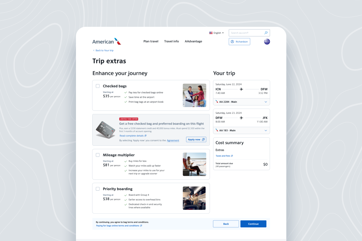
The checkbox concept emerged as the most promising solution, simplifying the process and accommodating both screen reader users and sighted users effectively.
Outcomes
Upon launch, we will maintain the test and learn approach, monitoring user interactions and gathering feedback through analytics and production testing. This data will help us assess the effectiveness of our design and identify areas for further enhancements. Expected outcomes are:
Improved User Experience
Streamlined selection and enhance accessibility, is expected to increase user satisfaction based on preliminary feedback and usability testing.
Business Benefits
Improved operational efficiency and increased conversion rates once the product is live.
Integrated products
By implementing a SPA page, bags, Priority boarding, and Mileage multiplier can be easily implemented into any customer journey.
Depreciation of legacy software
Furthered the organizational goal of modernizing aging technology